The Logo Saga

The name was silly and had a general fantasy feel which I liked but it didn’t provide much information about the game. The logo would need to communicate more of the flavour and theme of Astrogarth’s Moggin to potential players.

You can see some of my first ideas in the previous blog post. I started by taking simple dungeon related objects; weapons, blocks of stone, items of treasure and just wrote the name on them to see how that worked. I liked the simple silhouette this approach gave but I quickly realised that it didn’t match with the art style I had in mind. From there, I tried to give the type some personality, exploring heraldic elements and illuminated lettering, and by forming the letters from monster parts or metal. This seemed to work so I began to develop the idea further.

Metal concept

Metal concept

Metal seemed a good choice for the logo. A rusty texture with angular shapes could hint at weapons, armour or dungeon traps. Shiny golden text perhaps studded with jewels would let people know the game involved treasure. I found it difficult to decide which would work best but eventually realised that I didn’t have to choose. If I used a different material for each word, I could communicate twice as much.

Monster concept

Monster concept

Taking that idea further, perhaps I could communicate even more if I chose a different material for one of the words? I tried forming part of the logo from monster parts. I liked this, but I felt there was too much contrast between the squishy shapes of the monstrous parts and the hard edges of the golden text and I really liked using weapons as letters in the all metal version so I pushed ahead with that concept.

Metal logo rough

Metal logo rough

Working up a more polished version of the logo, I decided to try a different font for ‘Moggin’. There was a particular typeface that I remembered fondly from childhood, specifically it was used as the title font for Ralph Bakshi’s 1978 ‘Lord of the Rings’ movie. To me, this is the ultimate fantasy font, so I felt I had to try it out as part of the logo. I love that font but sadly it wasn’t chunky enough, so I went back to the original type.

Metal logo final

Metal logo final

Everything seemed decided, so I produced a final rendering of the logo. It was colourful, chunky, clearly told the viewer that the game involved weapons, treasure and possibly spiky things. I had my logo.

Or so I thought. Fast forward just over a year. The game was now in a more complete state and I was beginning to put together final card designs, think about promoting the finished product and putting the website together. Once I began placing the logo onto web sized images and the card backs, I knew it would have to change.

Logo silhouette

Logo silhouette

The rendered logo was just too detailed. I found the only way to make the logo work at small sizes, or against other detailed images was to go single colour and use it in silhouette. I’d designed the logo with that in mind thinking it might be necessary to drop back to a single colour version in certain circumstances, but it was becoming clear that those circumstances were most circumstances. Fiddlesticks.

All was not lost, however! I still liked the shape of the logo and the horned helmet, sword and axe elements continued to come across even in silhouette. It worked. I’d just lost the communication that came from the metal textures.

Crest logo rough

Crest logo rough

The solution was simple. Keep the silhouette, knowing that would be how the logo would appear in most cases, and add an additional element that could sit behind the logo when a more graphic logo would work. This gave me more freedom than trying to integrate elements into the logo text and I quickly understood this was a better solution than the original concept.  It gave me the option of dressing things up while keeping the appearance of the logo consistent. Returning to the original logo ideas, I settled on a heraldic theme and developed a simple coat of arms with an axe, wand and crown to hint at the game’s combat, magic and treasures.

This was not the only time practical considerations caused a change of design during the development of Astrogarth’s Moggin.

Crest logo final

Crest logo final

Name of the Game

Finding a title for the game was difficult. After referring to it simply as ‘the game’ for several weeks, the working title became ‘The Golden Parsnip’ after one of the high-scoring treasure cards in the game at the time. I wanted any name to communicate something about the theme. Getting fantasy, magic, combat, treasure, adventure, peril, excitement and humour into a snappy title was obviously going to be a challenge but I wanted to hit as many of those notes as possible.

Treasure is the most important aspect of Astrogarth’s Moggin so that’s where I concentrated my efforts. Golden this and that. Glittering whatnot. Legendary thingy. Nothing I could come up with was much more interesting than ‘The Golden Parsnip’. Descriptive, but dull. The problem persisted for several months.

Then one day I was chatting on the phone to my brother Ben. He’d recently played the game and asked how things were going. I told him I was struggling to come up with a title. Conversation moved on and, for reasons I no longer remember, he began to tell me about dream he had which featured a progressive rock album called ‘Astrogarth’s Moggin’. At this stage in the tale I should point out that Ben is a musician and one of his bandmates, of Scottish heritage, had brought the word ‘moggin’ to our attention several years previously as slang referring to a sock or similar receptacle where someone of a miserly nature might secrete their money. Anyway, at the mention of the fictitious album from my brother’s dream, everything dropped into place. I knew immediately that was the title for the game.

First logo ideas

First logo ideas

It had everything. ‘Moggin’ referred to the collection of valuables. ‘Astrogarth’ inspired a fearsome boss monster to hide inside the dungeon. Together, they provided an abstract title which wasn’t exactly descriptive, but had a definite ring of fantasy to my ears. I’m not one to look for cosmic synergies but knowing the name had come to Ben in a dream, just like the idea for the game had come to me, also made the title hard to resist. If those reasons weren’t enough, it was also gloriously silly. AND the .COM domain was (unsurprisingly) free! Perfect!

First logo ideas

First logo ideas

Generous credit to Ben for the inspiration, also to Colin, and the rest of clan Murdoch, for carrying the magnificent moggin south of the border.

At last, my game had a name. Now the name needed a logo.

Moment of Truth

The first prototype was now completed. There was no art but I was hopeful that the names of the cards would carry enough of the game’s humour to judge if the general flavour came across and at that early stage it was most important to prove that the mechanics worked as intended and were enjoyable. If the game was fun to play without illustrations, I figured the art should only enhance the experience.

The first playtests filled me with unexpected anxiety: What if the tone, an affectionate parody of the fantasy genre I’d loved since childhood, was too obscure for the average player? What if people didn’t like the humour? What if it just wasn’t fun to play? Worse than all those doubts, however, was the moment I presented the game and had to explain the rules for the first time only to realise that I didn’t know what they were! Of course, I knew how to play the game, but I’d never had to articulate the rules to others before. I was very nervous as those first hands of cards were dealt out.

First prototype

First prototype

Initial playtests were with family and friends. This group spanned a wide variety of ages, most of whom were not regular gamers. To my enormous relief, the game seemed to work, and everyone appeared to enjoy themselves. The cards and interactions with other players provoked plenty of laughter which was exactly what I’d hoped for. There were plenty of things which needed to be adjusted or improved but overall it was a very encouraging start.

Playtest nbtes

Playtest nbtes

Those first games were relaxed. I just wanted some reassurance that everything worked and that there was some fun to be had when playing. The next round of playtesting was more scientific and I began to record how long games lasted, how frequently players were knocked out of the game early on, how many games could be played before players began to lose interest and other statistics which proved invaluable as I continued to refine and balance the gameplay.

Testing continued to be overwhelmingly positive and I got a real kick from watching players enjoying the game. It was about that time I realised that ‘the game’ was going to need a name…

First Steps

My entire career has seen me involved with game development of one kind or another, but I’ve never made a game of my own before. Where to start?

First, I decided to confirm that I had an original idea. There would be no point developing a game that already existed, so I went online and began researching games with a similar theme. I knew I would find other dungeon-crawling card games, but I was relieved to discover that none seemed to have quite the same flavour as my own. The next step was to order some games to get a better idea of how they might compare with mine and ensure the game mechanics were sufficiently different. Though I studied the rules of these games, I chose not to actively play any of them in case that somehow influenced my own ideas.

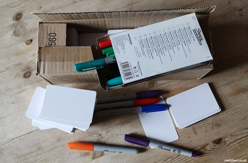
An unexpected side effect of the research process was an introduction to the components and packaging that could be used in a card game. The physical nature of my own game hadn’t really entered my head until that point but I could suddenly visualise exactly how I wanted it to look. That helped to decide my next course of action: I ordered some card blanks and a box of pens and prepared to make a first prototype.

Prototyping tools

Prototyping tools

I knew what the basic ingredients of the game should be, but I felt quite intimidated by the pile of blank white cards before me when I sat down to start work on the prototype. Thinking back to the dream and looking through my notes helped things to slowly start flowing. Far from the difficult task I was expecting this to be I was surprised to find I was soon having a lot of fun and laughing out loud as I worked. If that happens when I’m illustrating, I take it as a good sign and a chance that others will also enjoy what I’ve done. I hoped the same would be true of card games!

First cards

First cards

As the cards piled up, I realised there would have to be a limit. How many cards would be practical, and would that be enough to include all the elements I felt were necessary to sell the dungeon-crawling experience? Would there be enough variety to give the game replay value and to keep the humour fresh? Lots of questions began to come to mind. Only one way to get the answers…

Playtesting!

The Dream

It’s 6:30am. In a small flat somewhere in West London, a frenzied apparition tumbles out of bed into unfamiliar surroundings and begins beating at the walls in an unsuccessful quest for a light switch. Blundering on through the half-light, colliding with walls and items of furniture, a clutching hand eventually comes to rest on a small bag. Burrowing through the contents, a pen and some scraps of paper are extracted. The delirious figure hunches over a low table in the gloom and begins to scribble.

I am that tumbling buffoon and so begins the tale of Astrogarth’s Moggin.

First scribbles

First scribbles

My name is Matt Dixon. I’m an illustrator working in the games industry. Over the coming weeks I’ll be charting the development of my first game here. Let me start by giving that opening scene some context: I was in London for a comic convention. As usual I’d travelled down the day before the event to set up my table and had returned to my digs near the venue for a pizza and a few beers before some much-needed rest. Sadly, my slumber was interrupted by a dream.

It was a dream about a card game and such a vivid experience that it woke me with a start. I leaped out of bed, desperate to note down some of what I had dreamed before it faded from memory. In the foreign environment of an AirBnB apartment this proved to be a challenge and there was much stumbling and cursing in the dark before I finally located the necessary tools and began some frantic doodling.

Doodles from the convention

Doodles from the convention

My wandering marks made in semi-consciousness don’t make much sense, but they helped me to pin down some of the ideas from the dream. Anyone who stopped by my table at the comic convention later that day must have found me rather distracted as the dream was all I could think about and I took every opportunity to make additional notes as new ideas came along. By the time the weekend came to a close, I had the bones of a card game in my head and pages of untidy notes and doodles. On the journey home, I decided that I would try to make the game a reality.

But how..?